Today's challenge at Young Crafters Unite is to use a technique you learned recently, or to share your favorite technique on our project.
You might remember the card that I made for the second round of Gallery Idol this past summer- I used quilling on a card for the first time. I really loved how it came out, but never tried the technique again because it was difficult and time consuming. For this challenge I wanted to simplify some things, and give it another try:
- Instead of making my own "quilling paper" out of cardstock (which ended up being a little too thick), I bought a package of quilling paper at AC Moore for 3 or 4 bucks.
- I did a simple design, instead of the detailed swirled design on my Idol card. ***see note at bottom of post***
- I used thinner glue- Tombo Mono Multi Glue
Here's the result:
(I'm submitting this card to the Asymmetry Challenge- I've kept most of my elements left-justified, with the exception of the sentiment to balance it out. The washi tape "arrow" pointing to the sentiment helps to lead your eye in that direction)
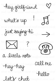
Cute, right? If you check out the set I used from Neat and Tangled, "Just Hello," you'll see where I got the idea for the envelope. I chose to replicate that stamp because it was simple and had sharp, clean edges.
I hope you play along! We have 2 sponsors- Simon Says Stamp AND Neat and Tangled!
***note: I know I was trying to act all cool before- saying that I chose the envelope for it's simplicity. But....that's kind of a lie! My FIRST thought was to recreate the phone. I was stamping at Jessica's with her and Suzanne that day, and I think I spent about 30 minutes fiddling around with a strip of quilling paper, attempting to mimic the soft curved lines of the telephone stamp. One frustrated and crazy outburst later, this is what found itself hurled towards Jessica (not AT her...but in her direction) in a fit of rage:
Yikes. My suggestion: keep it simple, and everyone stays safe.


This is really cool. Love the side view.
ReplyDeleteThat envelope is fantabulous...you are always such a clever designer!
ReplyDeleteWhat a new and different idea. Wonderful, especially in those colors.
ReplyDeleteway cool, play it safe witb objects...but NEVER in design ;)
ReplyDeleteBut all the rage was worth it in the end! Your card is awesome!!!
ReplyDeleteWhat a pretty card! Love the simple pink envelope! so funny you tried to do the telephone first :)
ReplyDeletethis is so cool, that envelope looks amazing, I can't imagine how you manage to get it to stick down!
ReplyDeleteThis is really cool. I've never liked the look of quiling.... Leave it to you to make it look awesome. Great job so fabulous.
ReplyDeleteHey Jen! Thanks for linking this up to the Asymmetry Challenge in the Moxie Fab World! I'm so glad you joined in on all the fun! :)
ReplyDelete