header

Pages

1.31.2012

For Cath (sans CHA) with Love Blog Hop


Have you heard? Sadly Cath (of the Moxie Fab World) is unable to attend CHA this year due to pain in her shoulder.  Lorena and Virginia organized a blog hop to cheer her up....sweet, huh?  And since I jump at most opportunities to participate in a blog hop, I knew I had to join.

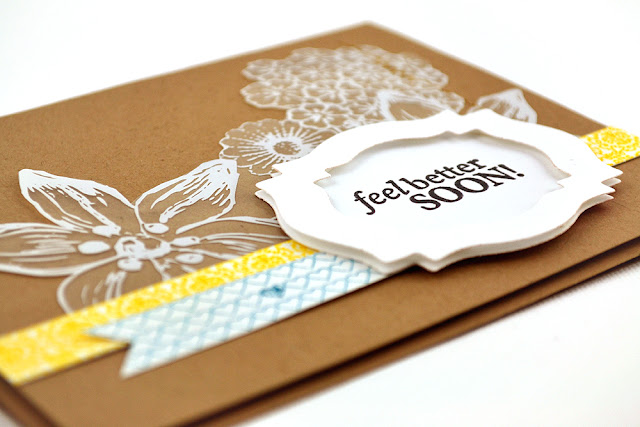
Here's a card just for you, Cath!


I think I need to get more Nestabilities....the ones I used on my card are from my one and only set!  I love how easy it is to make a layered label with them.  I'm putting them on my wishlist!  I used some fun Hambly goodies on this card too.  This overlay, and these washi tapes.

By the way, this card is headed straight for Cath's Die Cutting Challenge :)

1.29.2012

colorful congratulations

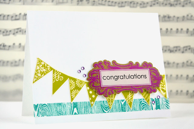
I've had such a nice, relaxing weekend. Don't you just love those? I had time to get crafty too- here's a card I made for the recent Patterned Paper Challenge at Lily Pad Cards.


I had a lot of fun with the colors and pattern on this card.  I cut the banner out of the Hambly Screen Prints paper you see below, called "Banners."

The washi tape and label sticker are from Hambly too.

Speaking of Hambly Screen Prints, have you seen some of the new products!?  Holy moly- they sure are awesome!  Check them out on the Hambly blog:


1.28.2012

OCC Hip to be Square

Today there's a new challenge over at Our Creative Corner, and sadly, it will be my last challenge as a member of the OCC DT.  This was a tough decision for me to make- OCC was the first design team I ever served on, so it definitely holds a special place in my heart.  It has been a blast to design with those wonderful gals each week over the past year, and I hope to continue to play along with their challenges from time to time.

Now onto this week's challenge.  Lori, our hostess, is giving us this sketch to work with:
For some reason, this one really stumped me!  I sketched out a bunch of ideas, until I finally came up with something:

Now, don't be fooled by the humongous picture- this card is just shy of 3" square....so it's teeny tiny!

Before I sign off, I wanted to say thank you to the girls at Our Creative Corner- it's been a wonderful year :)

1.27.2012

a do over

Have you ever looked at your old projects?    For me, it is always strange to look back to things I have made \with a new pair of eyes.  Sometimes I get that overwhelming "what was I thinking"?" feeling.

Amber recently set up a challenge for her readers- to go back and find an old card to re-do.  I looked back into the archives to find my most heinous creation.  Well folks, this is it:

   (and yes, I am SO embarrassed by it, that I refuse to make that picture any larger than it is now!)

Let's see....2 different patterned papers, a terribly ugly/poorly sewn ruffed fabric border, a twisted wire tree complete with seed beads at the end, an arbitrary fuchsia square, and a random bow.  Yikes- what a mess!

For my remake, I kept a few things- the tree, the green color, and....well.....I guess that's it.  Oh yea- it's also portrait orientation:


Ahh...now that's better!

(quick update...someone had asked about that tree stamp.  It's from Inkadinkado, although I got it a while ago, and cannot find it on their website)

1.26.2012

CASE Study 4

Well, this is it. My last week as the January CASE Study muse  :(  It's been a lot of fun...so thanks again to Chupa and the CASE Study DT!

Today's inspiration card is one that I originally made for the September PTI blog hop challenge.


Wow...that embroidery floss is so classically "me," isn't it?  Which is why I'm sure you'll be shocked to find out that I didn't add any embroidery floss to this card!  Instead, I took a big breath, braced myself, and opened up a container of glitter (This was 3 days ago, and I am STILL plagued by miniscule flecks of blue!)

I hope that dealing with the glitter was worth it for my card:


Ooooh...shiny!

It might be tough to tell, but the glitter is actually flush with the white cardstock.  I used my craft knife (that's in bold for you, Cath, so you know why I entered into the Cutting and Trimming Challenge!) to cut the three rectangular openings, then put a piece of packaging tape behind the opening so the sticky side was facing out, and sprinkled on the glitter!  I learned this technique from Lisa, here.

So glad you could stop by! And if you play along with CASE Study, tell 'em I sent ya!  :)

1.25.2012

a true friend


I thought I'd join in with the PTI blog hop festivities!

The challenge is to share a favorite card from 2011, then to create a new card inspired by it.  Here's one that I love, which I originally posted back in February:
And here is my new version:


I am also linking up to the Penguin Suit challenge at CAS-ual Fridays!

stitched sunburst

It's "old stamps week" at SP and Company, so today I am featuring the set Sewing Chic.''

I have to admit- my card is a complete CASE of this awesome design (scroll down the post- you'll find it)


With all of the shininess, the stitching, and the layers, I figured it was best to keep things simple and omit the sentiment.  (by the way, that amazing shiny paper is from Hambly Screen Prints)

So glad you stopped by!

1.24.2012

Penny Black

Just popping in to let you know that I am guest designing over at the Penny Black blog today!

1.23.2012

YCU Challenge #6

Today I'm here to help deliver a brand spakin' new challenge for Young Crafters Unite.  This month, we have a sketch challenge:


And here's my card:


I don't often use colored card bases, but I thought red was just perfect for this card!  For you non-French-speakers out there, "je t'aime" means "I love you."

Here are the links to the DT:

I hope you decide to play along...there's a $25 GC to Simon Says Stamp up for grabs!

1.22.2012

Home

I just got out of my craft room, and am happy to share this card I made for 2 different challenges.  The first one is the Map to Your Heart challenge at the Moxie Fab World.  The other is the very first Virginia's View challenge at Lily Pad Cards.

Here's what I got (inspiration explanation below the pics)


I used the map for the Moxie Fab challenge, of course, and I printed the sentiment.  I put the heart near the window of the house not only because it worked so well with the sentiment, but because the inspiration photo for Virginia's challenge was a bunch of paper hearts in a window.

Thanks for visiting....I'll be back soon with my card for YCU!

1.21.2012

OCC Photo Inspiration


Good morning, today there is a great photo inspiration challenge over at Our Creative Corner, hosted by Lori Rider.

Check it out:
Sweet, huh?

Here's my take:
Today is my wedding anniversary.....I probably should have made an anniversary card!
You can check out the rest of the DT samples over at OCC

1.19.2012

CASE Study 3


I'm so sad that my month with CASE Study is already half over!  It's been such an honor to be the muse, and I love seeing everyone's creations.  We only have this week and next week left, so if you haven't yet- please play along!

The challenge for today is based on this card below:

And here is my updated version:


I'm linking this card up for the die cutting challenge at the Moxie Fab World.

I hope you go check out what the DT made over at CASE Study!

1.18.2012

sweet baby

Hey there,

Today I'm posting using SP and Company stamps  (by the way, you can check out the project I made yesterday using balsa wood on the SP Stamps blog).

The 1, 2, and 3 on my card below are from the set "One Two Three," (haha, perfect!).  I stamped them in VersaMark ink to keep the look subtle.

So glad you could stop by!

1.17.2012

ric#4

Good morning!  I am extremely excited to share today's Runway Inspired Challenge.  Our sponsor is Clear and Simple Stamps, and the DT got to use the Lucky Charm set.  It goes so perfectly with our inspiration pic, from Christopher Kane's latest resort collection:


Wow! Check it out- this girl loves rainbow, and isn't afraid to let everyone know!

I love rainbow colors too, which is why I was so excited to make this card.  I haven't done a rainbow floss card in a while, so I thought this was a great opportunity to bring it back:


Also cool - Since Clear and Simple Stamps is sponsoring the challenge, I was able to make an extra project to be featured on their iPhone App!

The DT has some fabulous projects to share with you as well:
Aga

What are you waiting for?  Get your butt over to the Runway Inspired Challenge to play along!

Related Posts Plugin for WordPress, Blogger...